Process & Insight
Create
Everything from
the Ground up
Combining a range of different brands into one clean and consistent message.
View Website
Our goal was to create a branding that felt simple and intuitive while still expressing the depth and richness of the renovation experience.
Typography

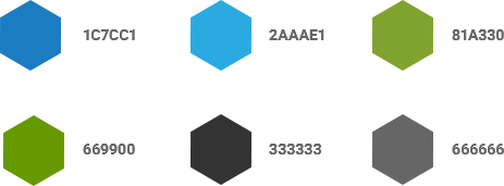
New Color Palette

Custom CMS Creation
Project Sales without project packs
Manageable interactive banners allow for the site to showcase a finished project, with the ability for the customer to select the items they need quickly and easily without being taken away from the category.
Schema Mark-up On All Products
In-depth product information powers the google knowledge graph and powers you up the search. Descriptive mark-up built into the code explains each element to search with no additional administration time required.
Sales on the Phone
Payment Links For Sales
On The Phone
Blueprint create and build customer orders and products for both businesses and personal customers. They were looking for a solution to enable easy payment of phone orders. The CMS enables them to create the order for the customer and then send them a link to pay. Not only will this allow for payment but lets the customer add last minute additions to their order.
Doors to Standard
Different Category Design For Doors To Standard
Due to the difference in how people purchase doors to stair parts it was decided that the different categories should have a different feel without distinctly altering the flow. Allowing for each item to be better featured.
Independent URLs For Each Variation
Each variation has a distinct URL from the product. This allows not only search engines to index them individually, but also for customers to deep link directly to the size and colour that they would like. This is loaded in such a way that the page will not refresh each time you make a change to the options.
A Spindle Calculator To Reduce Calls To The Office
The most often ask question making customers call the office was “how many spindles do I need” the simple addition of a spindle calculator that works out the numbers for you based upon the landing length and the number of steps was included in the site. This freed up the call handlers to deal with other requests.
Advanced shipping levels calculations
Weight and location alone will not work for lightweight doors as they will always need to be sent on a pallet. The addition of services to allow for handling of multiple couriers in one order and product level segregation for Bulky and Standard items, allows the system to work out the cost to Blueprint, and the contribution the customer will need to make is displayed on the product page. No costly surprises in the cart.
Dedicated
Mobile
With such a varied customer using the Blueprint Joinery site, we had to be certain that it could be accessed from the family desktop through to a builder or interior designer who is visiting a project site.
By ensuring that the website also has a dedicated mobile website, the team at Blueprint needn't be concerned that there is a potential sale being lost due to poor accessibility on a smartphone.
Responsive
to Tablet
Get the full-site feeling on your tablet. Sticky navigation and large interactive elements ensure that the tablet loses none of the functionality of the desktop site.