Background
The UK is made up of hundreds of City Councils and local government bodies, all of which demand a high level of involvement & correspondence from local residents.
However, only a very small percentage of councils have allocated resource to update and improve their most reliable point of contact: their website. i3MEDIA maintain a close eye on digital trends, including those both within the private and public sectors. Our consultants, developers and designers were told to ‘throw out the rule book’ and bring change to the way the Peterborough locals interact with their council.
View WebsiteStudy by O2 Shows
48%
would prefer to use the internet, mobile apps or social media to pay their council tax or access local services. Despite this, only 7% have been able to do so.
Initial Analysis
The Original Website
The site suffered from very apparent aesthetic and usability flaws that left the site looking incredibly dated and out of touch with current digital standards.
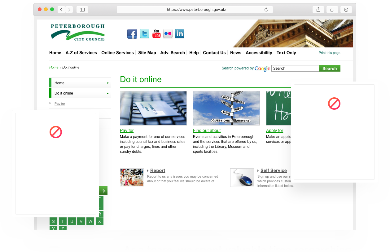
The council workers themselves also had various difficulties when managing the site from the back end. Simple tasks and capabilities such as updating and editing content on the site was a long and frustrating process.
The lack of detailed statistics with regards to the website meant that the user journey couldn’t be analysed and improved, leaving the site out-dated and non-user friendly.

It was clear from the outset that the site needed to double as a fully functional transactional website. This would, in turn permit residents to pay bills, council tax and fines, allowing for Peterborough City Council to lead the way with a ‘self-serve’ website.
As a team, we spent valuable time researching and testing other council websites and .gov sites to establish both the flaws and advantages from a user’s perspective.
With such a large-scale project and with so many different users; either with disabilities, language barriers or specific search terms, the site had to be right.
Our research took us right into the heart of those using the site, as we studied user behaviour, popular pages, bounce rates and sent out questionnaires to get the opinions of those using the site daily.

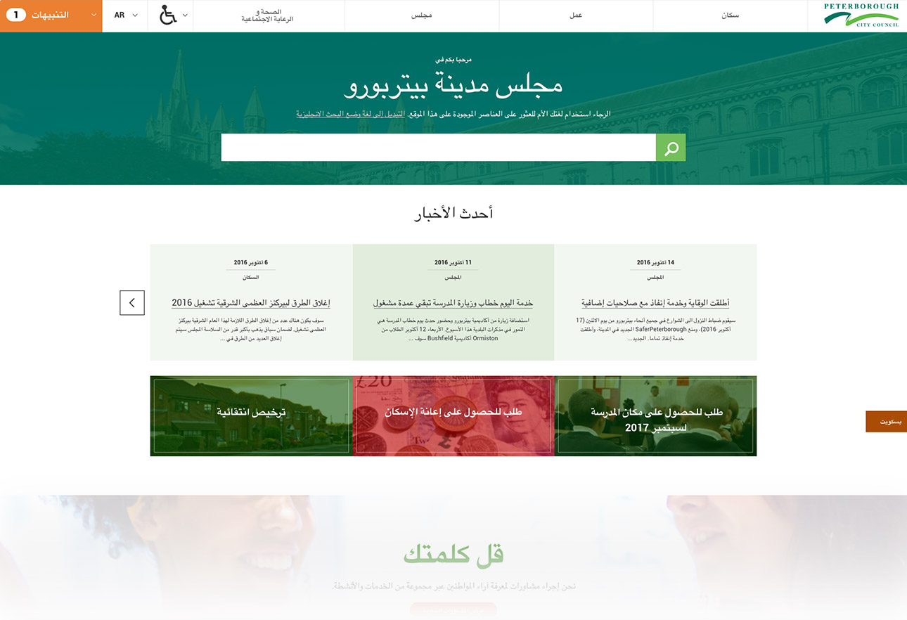
It was apparent that we needed to create a multi-lingual search bar considering the vast multicultural nature of the city. The team took this concept one step further by producing multi-lingual forms, making it easier and quicker for non-English speaking citizens to complete applications.
This wouldn’t only benefit the locals but would also reduce vital time and resource spent by staff redirecting enquiries and payments. It would prove to be invaluable as an efficiency tool.
Of course, this does not cancel out the many various queries received by local councils on a daily basis. However, the added integration of the Salesforce CRM resulted in an efficient process for the collating of enquiries and other vital information, in a seamless manner.
Powerful Search
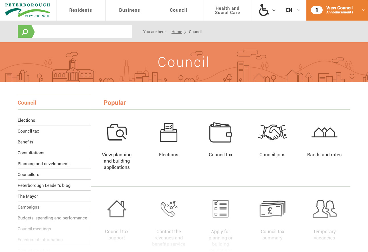
We developed a search bar so powerful that it returns accurate results from misspelt words and foreign languages.
Handcrafted
Icons
Promoted Results
Order
External Links in
Results
Transversal
Integrated FAQs
Abreviation
Search
Different Results on
Mobile to Desktop
Communications
The current political and economic climate has meant that austerity measures are placing strain upon local councils and their level of resource.
The way in which the site has been developed has minimised the amount of time spent communicating information.
In order to get this to the perfect stage from the outset, we held regular meetings with the council and third party suppliers, whilst also holding open days to gain further input.
By engaging directly with the users and the businesses involved, we gauged a great advantage within the project, allowing us to see exactly what the thoughts and expectations were.


Incredible Outcome
The site boasts an incredibly creative concept that makes use of iconography, colour and text to communicate, in comparison to the old site; that was weighed down amid a mass of content.
Users are now able to search via the intelligent search bar that was created and placed centrally to the site
-

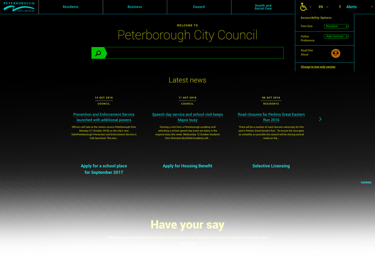
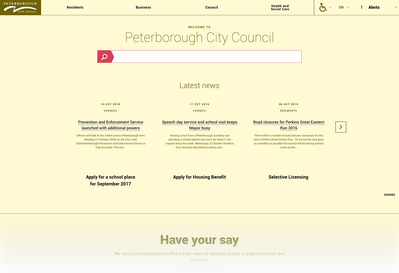
Accessibility
Double A w3c rating, tab navigation and multi screen reader testing ensures all citizens can access the essential information across the site.
-

Multiple language support
Integrated google translate api not only translates the site but also allows for multilingual search and forms to be translated back to English upon submission.
-

Council Notifications
Front and centre announcement area gives quick updates to citizens without the requirement of a new page.
Dedicated Mobile
It was imperative that citizens could access the council when out and about.
By ensuring that the website has a dedicated mobile site, the team at Peterborough City council could tailor the information and search on a smartphone for the differing user journey.
